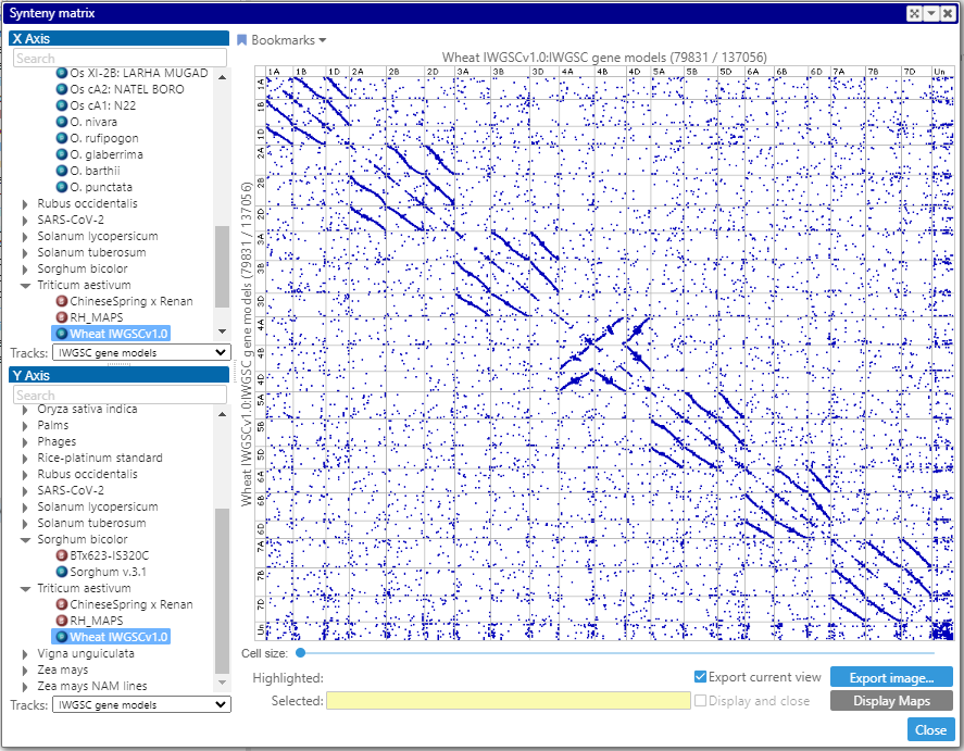
Synteny matrix in the Web version
We continue migrating the features originally implemented in the desktop application to the Web version. This time, we added the Synteny matrix – a dot plot that visualizes full genome comparison.
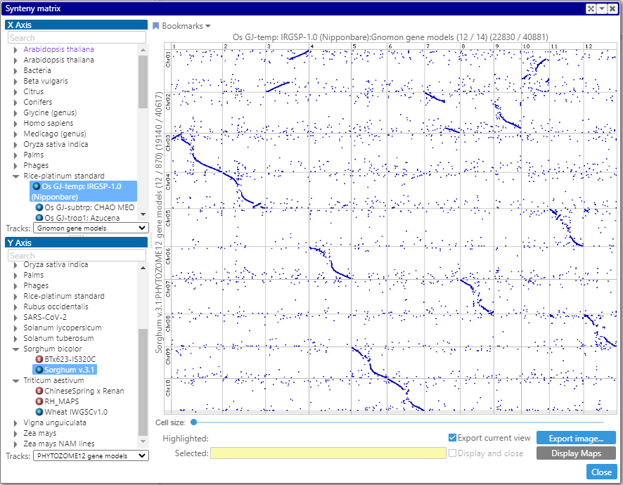
Each dot in the plot represents a connector – either a pair of identical markers or orthologous genes.
To display such matrix, first, select two map sets from the trees on the left. The maps of the map sets will be shown along the vertical and horizontal axes (up to 50 maps). The columns and the rows can be rearranged by dragging the corresponding headers with the map name. The entire view can be scaled by rolling the mouse wheel. A double click on a cell – or, if zoomed deep enough, on the visible part of the cell – will bring two aligned maps to the main view.
The view can be bookmarked or exported into an image.
Interestingly, the synteny matrix for the wheat genome helps visualizing the gene duplication. The plot of gene pairs reveal strong homology between A, B and D chromosomes, which is not of a big surprise. Besides that, you still can see the dots along the main diagonal. In the process of generating the gene pairs within the same genome, the self-hits (a protein sequence matches itself or a protein from its splice variant) are removed. Still, the dots along the diagonal show the hits in the same location, suggesting that neighboring genes are often a result of the tandem duplication.