The Web version of Persephone has many useful features; here are some highlights to get you started.
Welcome to Persephone
- Zooming in/out
- Multiple maps
- Select tracks
- Highlights
- Object details
- BLAST
- Quantitative tracks
- Importing external files
- Search
- SNPs
Zooming in/out
Persephone easily switches the view from showing an entire chromosome to looking at individual bases, bringing more details depending on the zoom level. That is why it is important to master the zooming technique – the working horse of the application.
Scaling the maps can be done in several ways.
- Resize individual maps.
(a) – Roll the mouse wheel when the cursor is over a map – similar to Google Maps. Hold SHIFT while rolling the mouse to get lower increments. Note that the map will start growing in size around the location of the mouse cursor.
(b) – Define a region of the map by dragging the mouse while holding SHIFT – once the mouse button is released, the program will start zooming in so that the selected area smoothly grows to the size of the screen.
(c) – Double-clicking on a map will increase zoom by a certain factor. SHIFT-click will reset the zoom and show the entire map.
(d) – Click and hold the left mouse button on a map. Wait for 1 second until the cursor changes to a loupe symbol. Then dragging the mouse will select the region to zoom in. - Resize all maps at once.
Put the mouse cursor outside of any map and roll the wheel. This is useful if you have more than one map and you want to concentrate on a particular region that shows good alignment.
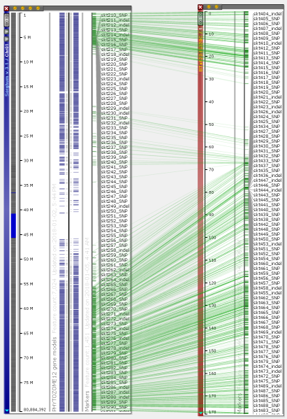 You can visualize the entire chromosomes and display several maps on one screen. Persephone can show genetic and physical (sequence-based) maps. When the maps are added to the main stage, they can be placed either horizontally or vertically. The vertical orientation is typical for genetic maps, which makes it easy to read the marker names. For the sequence-based maps, the normal orientation is horizontal. To change the map placement between horizontal and vertical, use the right-click context menu which will pop up over a map (to rotate a single map) or over the stage background to use a common orientation for all maps.
The maps are grouped into map sets usually corresponding to a particular version of a genome. The map sets are presented in the form of a tree shown on the left.
The maps are shown in the form of movable “plates” with tracks of different types.
The plates can be scaled by using the mouse wheel. You can move them around by dragging them with the left mouse button. A roll of the mouse wheel outside any map, on an empty background, will scale all maps together. Dragging the mouse over the map while holding Shift will define a region of the map to zoom into.
The tracks can contain different types of data:
- genomic sequences;
- gene models with CDS information;
- markers and other mapped features;
- quantitative tracks (RNA-seq, methylation, etc.);
- diversity data (SNPs and indels);
- NGS read alignments;
- synteny blocks
- QTLs;
- BLAST hits, etc.
Saving highlights
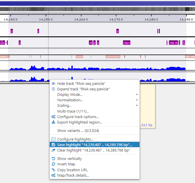
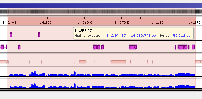
To quickly annotate map regions, use the feature which we call ‘highlights’. Hold the Ctrl key and drag the mouse over the fragment you want to select. The corresponding region will be highlighted with a temporary gray color. A tooltip will show details about the highlight, such as its coordinates and length. Another selection will remove the temporary highlight. To save the highlight and give it a name and description, call the right-mouse menu item ‘Save highlight…’.
Give the highlight a name and select a distinct color. The common transparency of all highlights is controlled in the Settings form under Maps tab.
Displaying detailed information
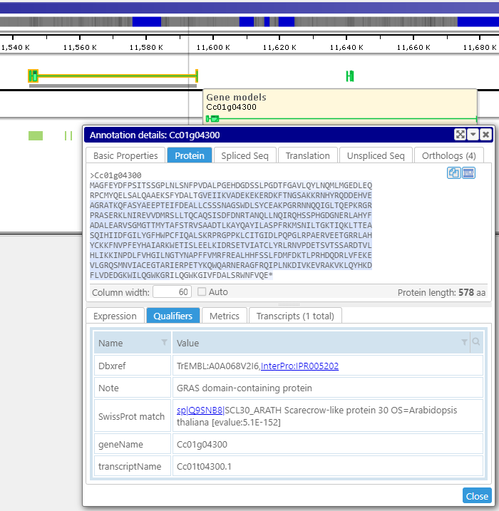 A click on a gene, marker, or other object displays their detailed information. It includes associated sequences, orthologs, all locations of the feature, and other properties. Various types of gene sequences, such as the transcript (spliced) or the translated protein, are generated on the fly from the genomic sequence and available exon and CDS coordinates. The less-structured qualifiers saved in the form of key-value pairs can be grouped into separate tabs. Some values can be converted into hyperlinks leading to external pages.
For maps, map sets or tracks, the properties are also available on the right mouse click – see Properties menu item.
BLAST interface
 The real-time BLAST provides a quick similarity search for a protein or genomic region. Interactive graphical output of BLAST results facilitates analysis of the matches. Click the Alignment tab to see which parts of the query sequence produce high-scoring pairs (HSP). The raw BLAST output is also available in a separate tab. A click in the summary grid will synchronize the views in the bottom tabs. For example, it will scroll the view in the raw BLAST output to show the text of the corresponding HSP or highlight and animate the selected HSP in the Alignment tab. The HSP selection can also be done by clicking in the Alignment or the Map tab.
Please note that the BLAST interface supports multiple queries and multiple subjects.
Clicking Display Maps and Close will close the form and add a temporary track with the BLAST results to the corresponding map.
Visualize quantitative tracks
Numerical values plotted vs. genomic coordinates are shown as quantitative tracks. Persephone can display charts with one nucleotide resolution. RNA-seq data is a good example of values shown in quantitative tracks.
The values in the quantitative tracks can be normalized based on the maximum value per entire chromosome or on the values in the visible part of the track. Please see Tools/Settings/General display tab. It has a check box “Dynamically scale BedGraph values to viewport”.
The view parameters for multiple quantitative tracks can be controlled via the right-click context menu. If the check box “Apply to visible tracks in the group” is checked, the change in Display Mode, Normalization, or Scaling will take effect for all visible tracks.
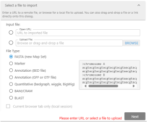 Create your tracks by importing external files.
Persephone will recognize
- FASTA files with genomic sequences.
- GFF3 and BED files with gene annotation.
- Excel files (.xlsx, .csv, tab-delimited) with mapped features.
- BedGraph or BigWig files with quantitative tracks.
- BAM/CRAM files with NGS read alignment.
- BLAST files with DNA or protein matches.
To create the track with your private data, you can drag&drop the external file or open the specialized Import dialog. Here, you can provide a path to the file or a URL to the external resource. It is typical to upload a genomic assembly in the FASTA format first and then attach gene annotation and other tracks to the newly created map set.
Please note that the imported data will be visible to you only.
Search rules
The search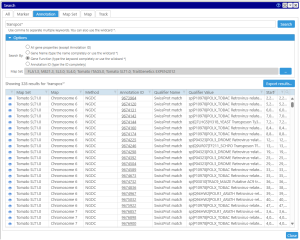 for Persephone objects is partitioned into several categories: search for a marker, an annotation, a QTL, a map set, a map, or a track. The search keyword can be entered as the whole word or as a partial token with the wild card (*). For example, your search criteria could be a full name of a marker, like ‘txp71‘ or a name mask ‘txp*‘ which should find markers with a name that starts with ‘txp‘. Using the wild card is sometimes important, as, for example, the gene names quite often include extra numbers specifying the splice variant (At1g01010.1). In this case, to find the transcript by gene name you will need to enter the name with the asterisk: ‘Atg01010*‘.
In general, most Persephone objects, besides the required attributes like name for markers or genomic location for genes, have optional properties, called qualifiers. Some of them have special meanings, like gene names or functional annotations. So, you can search through all available qualifiers or, if you are searching for a keyword in the gene functions only, you can limit the search space by selecting ‘Gene Function’ in the search options.
Please note, that an additional way to display information about a list of objects is available via the main menu item Tools/Export features by name. This interface will allow you to compose and export the output in a format that contains only those fields that are needed.
SNPs tab
The results of resequencing, normally provided in a form of VCF files, can be loaded into the system and shown in the SNPs tab. The data for genotyping samples can reside in the database, or dynamically loaded from the external VCF files provided by the user. The sample information coming from the database or from the files will be listed in the same grid that opens up once you select a map set of interest from the drop-down box.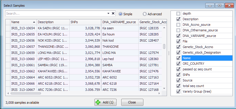
Each of the samples has the Name, number of SNPs and optionally can have extra properties useful for making selection. These properties are listed on the right and can be chosen to be included into the grid where they can be sorted or filtered.
Add several samples of interest by selecting the corresponding row in the grid and pressing the “Add” button.
Each added sample will create a sub-track in the graphics part of the page showing the SNPs in three colors: blue – same base as the reference genome, red – all alleles are different from the reference, green – heterozygous calls. Choose a chromosome from the list above. Select a coloring mode. By default, the colors used to draw SNPs follow the schema we have just described. There are two more modes of using the colors.
Reference genotype: one of the samples can be nominated as the reference. Accordingly, all SNPs that are identical to the SNPs in that genotype will be shown in blue color, and red will show where they are different. To enable this mode drag one of the sample rows to the box that says “Drop parent 1 here”.
Two parents: similarly, instead of one reference genotype, you can use two samples. In that case, the red color will show variants identical to the base calls in the second genotype. Enable it by dragging and dropping another sample row from the grid to the box saying “Drop parent 2 here”.
The grid with the chosen samples can be used to sort the samples which will affect the order of the sub-tracks in the track.
The values in the selected properties can be used to color the background of the sub-tracks. To do that, select the radio button under the column with the property values. If there are no more than 6 distinct values, each value will be assigned a separate color (controlled via the right click on the radio-button). If there are more than 6 distinct values, the range of the values will be shown as gray gradient.
Here we selected 16 samples from the 3,000 rice genomes. We color the sub-tracks by the variety group, that has 4 values. Selecting the radio button below this column assigns distinct colors to different variety groups:
Now, when the coloring options are selected, a click on the chromosome with sub-tracks in the bottom part will open this map in the vertical view where you can zoom in to see the individual SNPs and continue with the analysis in the horizontal view.


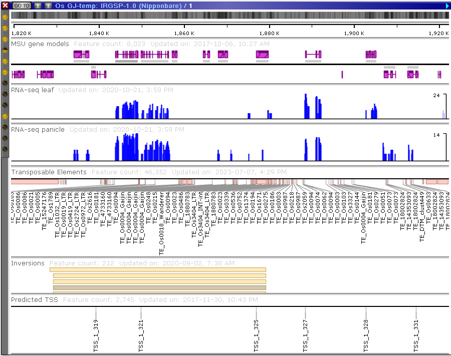
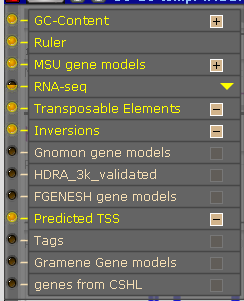
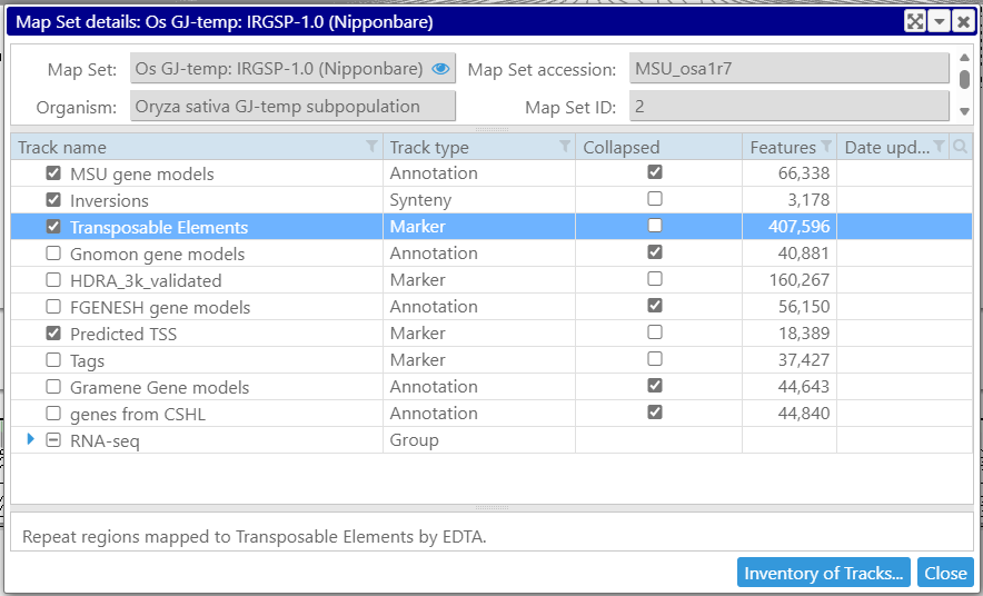
 .
.
